Are you struggling to find the perfect font for your blog?
It may seem like a small detail, but selecting the right font can make a huge difference in the way your audience perceives and engages with your content.
To help you out, we’ve compiled a list of the top 10 best fonts for blogs that are sure to boost your readership.
So let’s dive in!
Start a blog with no experience
Our free guide will take you through every step of the way.
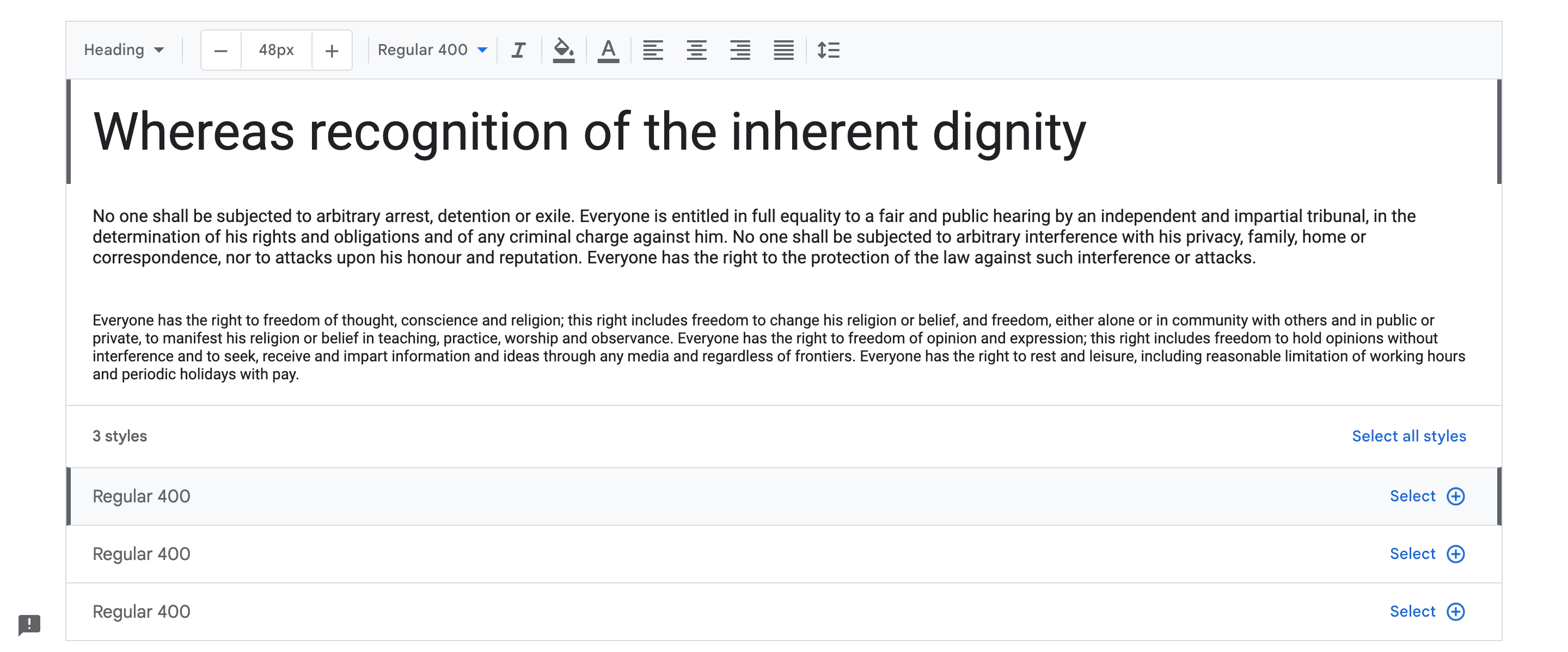
1. Roboto
Roboto is a sans-serif font designed by Christian Robertson. It is widely used in Google’s Android operating system and is known for its clean and modern look.

The font’s spacing and letterforms make it easy to read, even on smaller screens. This is incredibly important when it comes to blogging because you want your readers to be able to read and understand your content with ease.
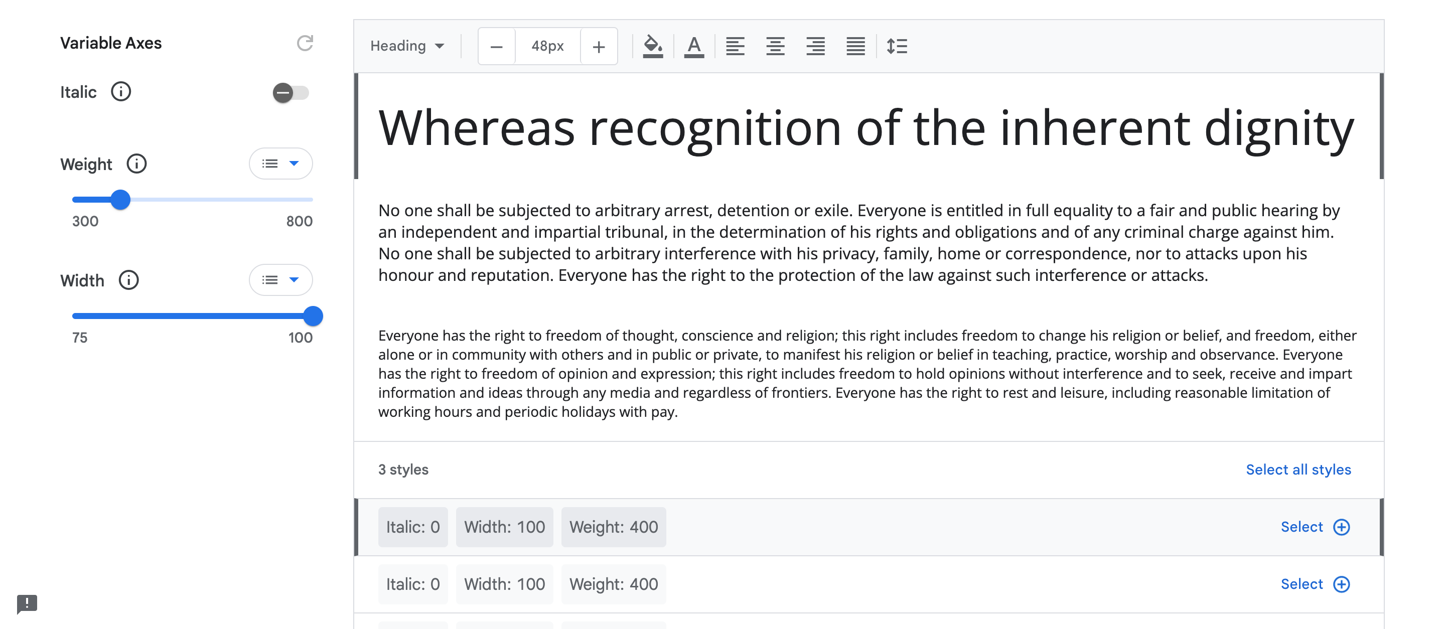
2. Open Sans
Open Sans is a font designed by Steve Matteson. It is a popular choice for both web and print design and is known for its clean and professional look. The font has a humanist design, which means that it has a natural and organic feel.

This is a sans-serif font, just like Roboto, but it has a slightly more rounded look. This makes it a good choice for blogs that want to convey a friendly and approachable tone.
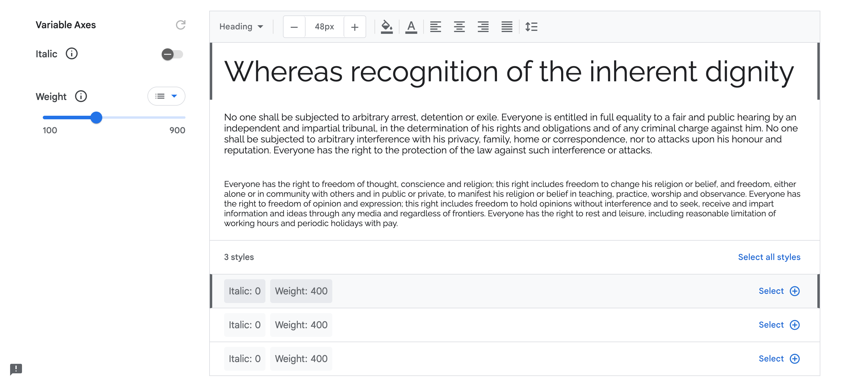
3. Raleway
Raleway is a sans-serif font designed by Matt McInerney in 2010, but it has a slightly more decorative look than Roboto and Open Sans. This makes it a good choice for blogs that want to convey a more artistic and creative tone.

Raleway is also highly versatile and can be used for both headings and body text. It’s a great option for bloggers who want to stand out and make a statement with their font choice.
4. Merriweather
Merriweather is a serif font that was designed by Sorkin Type. Thus font has a classic and timeless feel to it, which makes it a great choice for blog posts that discuss history or academic topics.
Merriweather is also a very versatile font that comes in a variety of weights and styles.
This allows you to use it for headings, subheadings, and body text. The font is also highly legible, making it suitable for long-form content.
5. Poppins
Poppins is a sans-serif font that was designed by Indian Type Foundry. It has a clean and minimalistic design that is perfect for blogs that want to convey a sense of professionalism and sophistication.
This is also a highly legible font that is easy on the eyes. It comes in multiple weights and styles, which makes it easy to use for different types of content.
Poppins can be used for headings, subheadings, and body text, allowing you to create a consistent look across your blog.
6. Lato
Lato is another sans-serif font that was designed by Łukasz Dziedzic. Lato has a modern and friendly look that makes it a popular choice for blogs that cover lifestyle or travel topics.
Lato comes in multiple weights and styles, which makes it easy to use for different types of content.
The font can be used for headings, subheadings, and body text, allowing you to create a cohesive look across your blog.
7. Proxima Nova
Proxima Nova is a font designed by Mark Simonson. It is a popular choice among designers and is widely used in web design. The font has a clean and elegant look, making it perfect for modern blogs.
It’s easy to read, making it great for long-form content, and also available in various weights, making it a great choice for creating a hierarchy in your writing.
8. Oswald
Oswald is a sans-serif font designed by Vernon Adams. It is a popular choice for headings and titles due to its strong and bold design. It is perfect for creating a bold and impactful statement on your blog.
This is because the font has a large x-height, which means the height of the lowercase letters is taller than the average font.
This makes it easier for readers to distinguish between letters and read the content with ease.
9. Source Sans
Source Sans is a sans-serif font that was designed by Paul D. Hunt. It is a modern and clean font that is widely used for digital media.
This is a versatile font that can be used for both headings and body text. It has a consistent design that ensures readability and legibility.
One of the main reasons to use Source Sans Pro is its simplicity. Its clean lines and open letterforms make it easy to read, even on small screens.
10. PT Serif
PT Serif is a classic serif font that was designed by ParaType, a Russian typeface company. It has a traditional look and feels, with small contrasting lines that extend from the ends of the letters.
The font is easy to read, with well-defined letterforms that make it stand out from other serif typefaces.
It has a traditional feel that can give your content a sense of authority and credibility. Moreover, its readability makes it a great choice for longer articles or blog posts.
Final Words
So there you have it!
Whether you’re looking for something sleek and modern or timeless and classic, there’s a font on this list that will suit your needs.
Remember, the font you choose can affect how easy your content is to read and how engaged your readers are.
So go ahead, give your readers something to rave about with a typography that pops.
Happy blogging!
Frequently Asked Questions
- What is the best font for blogging?
- The best font depends on your blog style, but sans-serif fonts are popular because they are easy to read on screens.
- What is the best font size for blogs?
- The ideal font size depends on the font family and device, but usually 16px to 21px works well. Around 16-18px is often perfect for easy reading.
- What color font is best for blogs?
- A white background with black or dark grey font works best because it is easy to read. Black stands out well against white, but dark grey is also a good option.
